RevelReal
RevelReal is the responsive web application that provides new and experienced users the power to explore and review information on potential investment properties.
My Role: Head UI Designer (CareerFoundry Student)
For this project, much of the UX research was already provided. Based on the user personas, I created user flows for specific tasks.
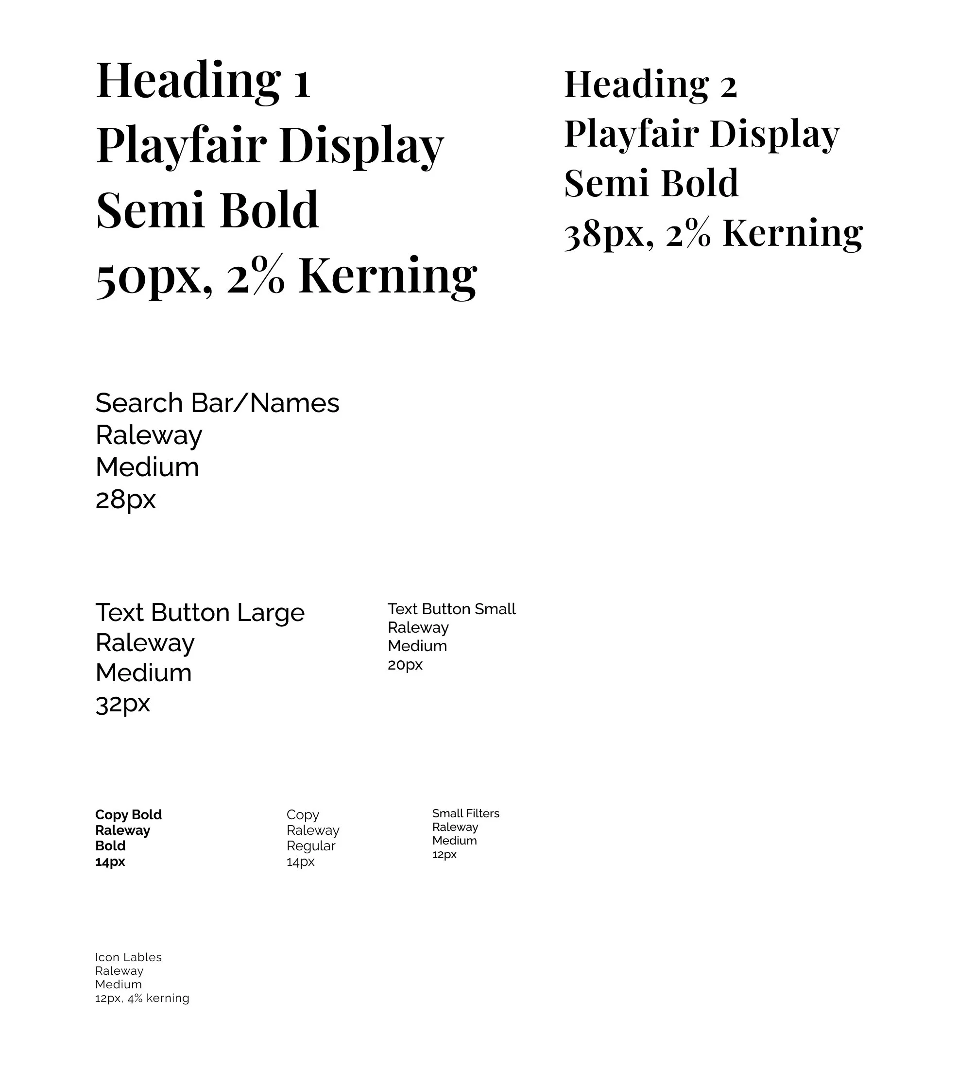
Next, using the brand guidelines I created mood boards, and made design decisions resulting in brand consistent typography, color & imagery.
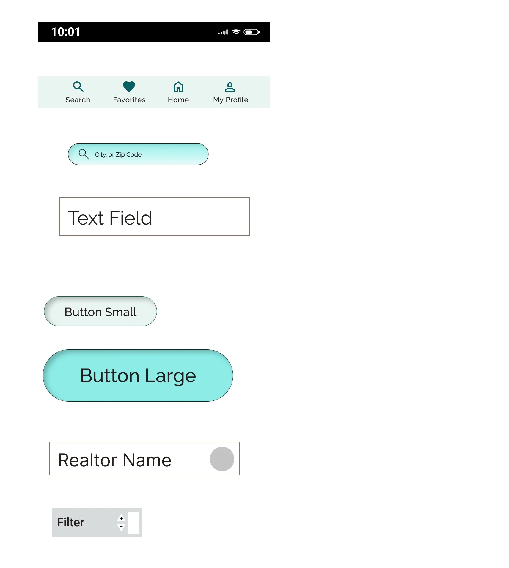
For the next step I created the UI elements, brand logos and icons that were specifically called for in the user flows to complete tasks such as personalizing user preferences, creating profiles, saving/hearting favorite listings, and more.
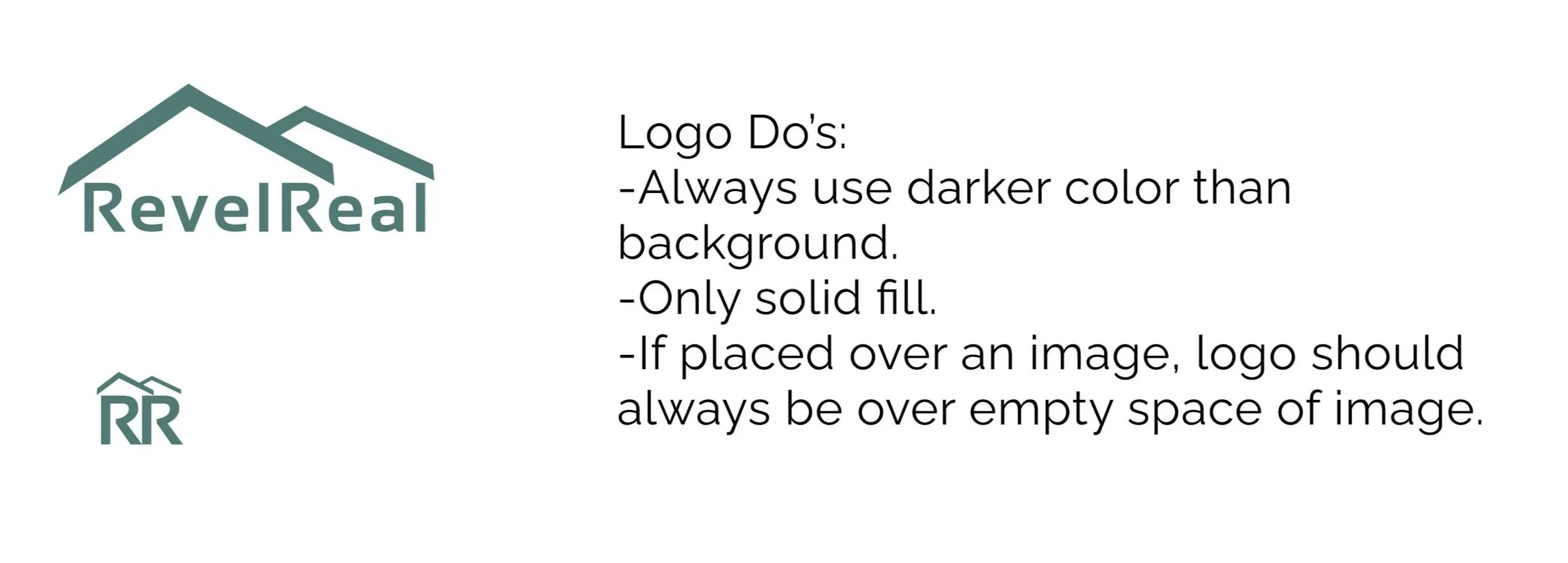
The final brand logos above were designed through several iterations. The final designs have a more modern, clean feel, and that do scale well to large and smaller sizes.
With mobile first design in mind, I then created grid layouts for mobile, desktop and grid breakpoints. The grid points included column counts with developer’s preferences in mind and I used 1000 row counts to help align for the sharpest wireframes.
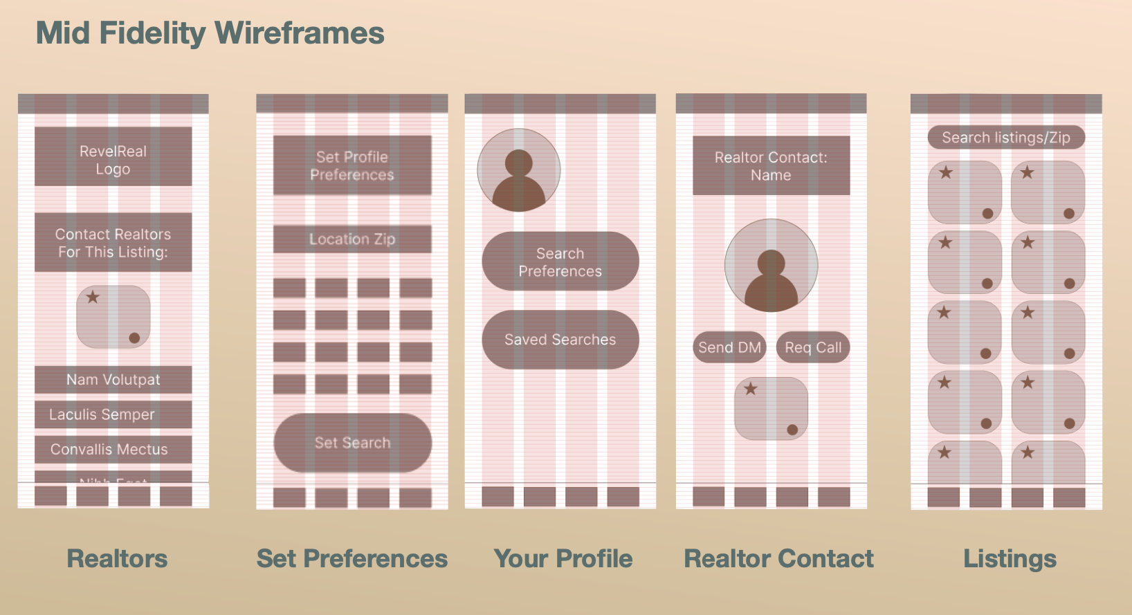
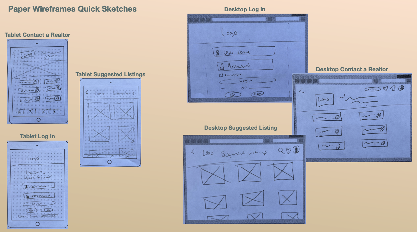
From here, I prepared to create all of the screens necessary to complete the user flows. To begin, I made quick sketches on paper and then iterated those into mid fidelity wireframes in Figma.
Before progressing the fidelity of the wireframes, I then did a review, and added UI design patterns that would be familiar to the target user. These included steppers, sliders, and favoriting options.
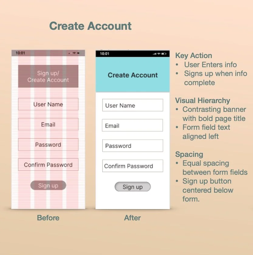
Next step was to begin adding color and updating screens based on design principles which include highlighting the key action, visual hierarchy and spacing.
From here I began to iterate the mobile screens to hi-fidelity wireframes.
I then updated the hifi wireframes based on feedback and preference testing.
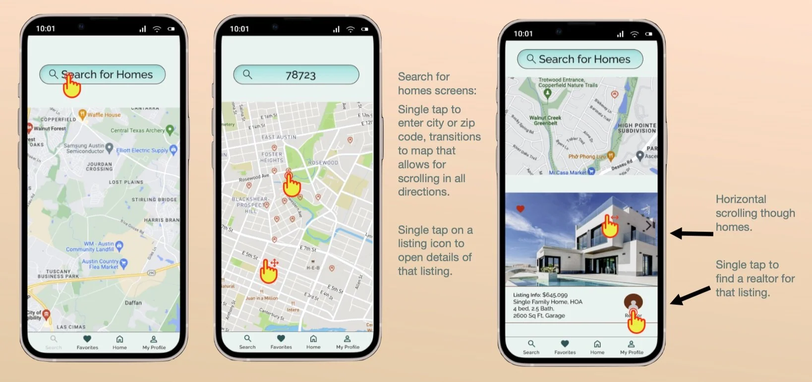
While designing mobile first, the interactions are always considered during each step of the process.
With the mobile design complete, I then progressed to designing for desktop and tablet breakpoints. I started again with sketching paper wireframes, and then moved on to using the grids shown above to create the responsive screens.
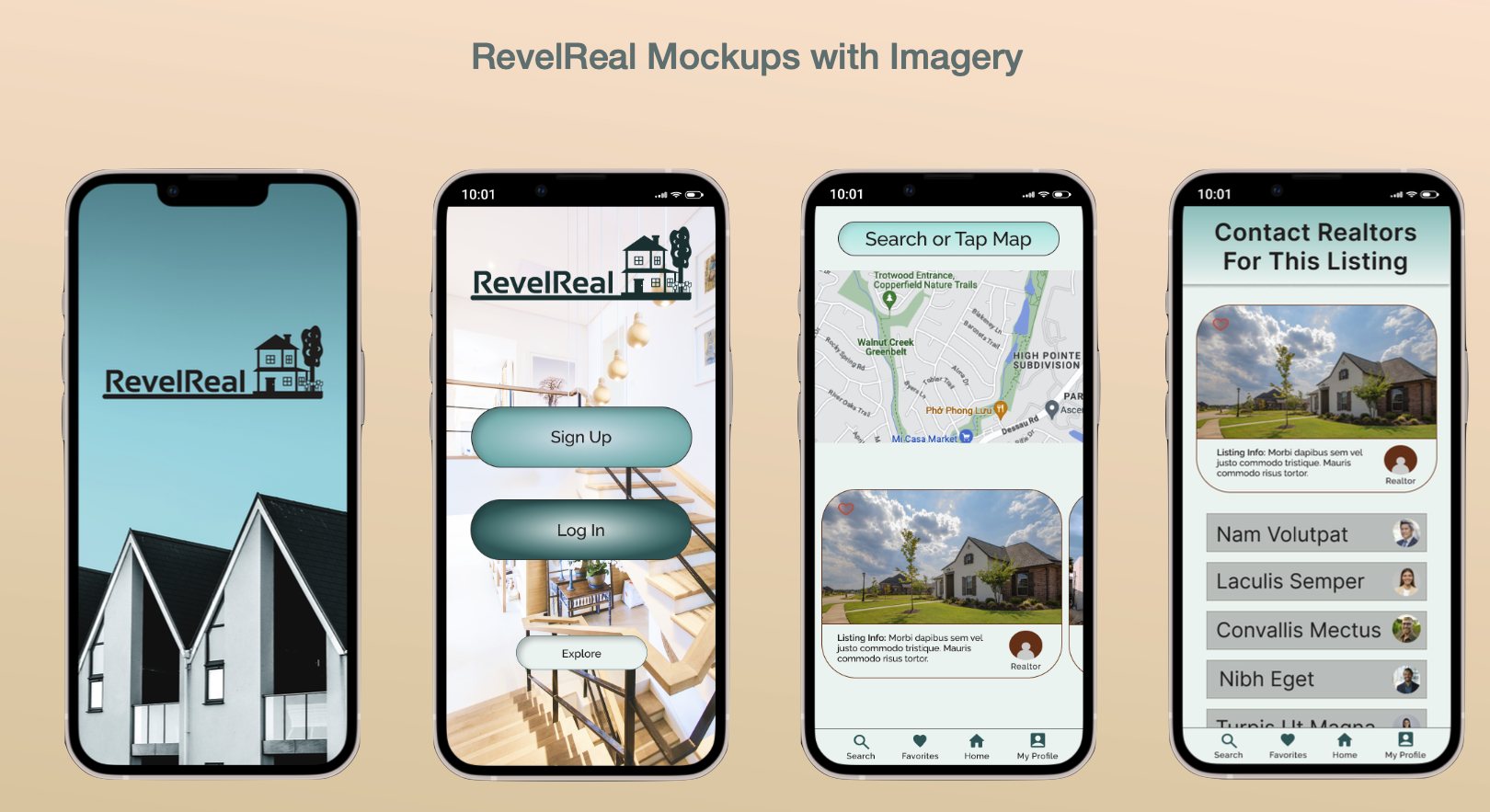
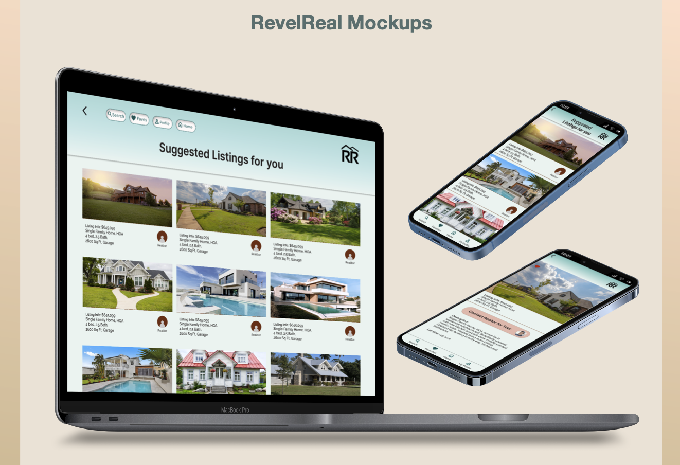
Final Design Mockups


