Project Overview:
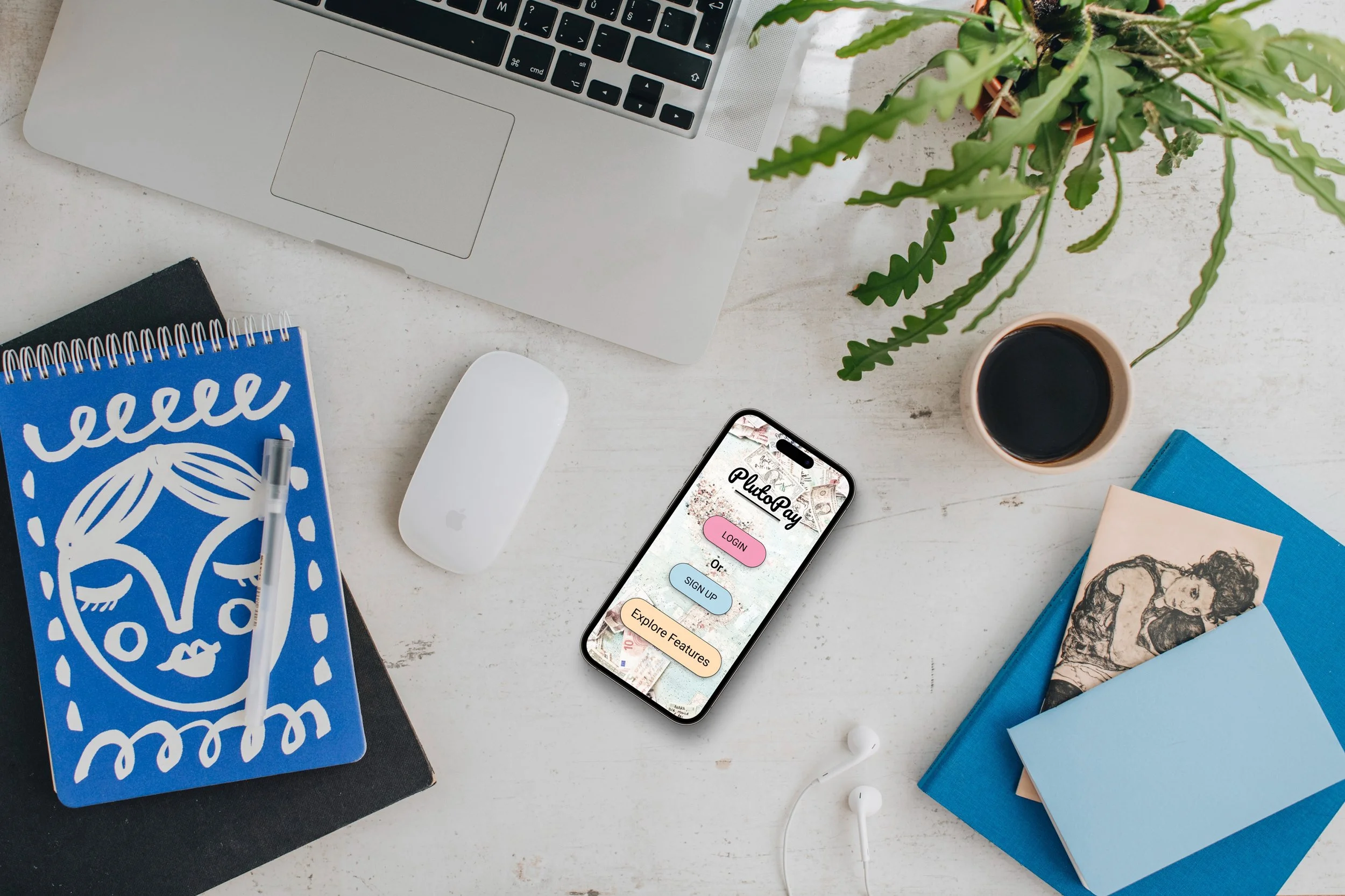
Plutopay is a secure E-wallet application that allows users to link their bank, credit cards & crypto accounts to make instant online payments to merchants, pay bills and send funds to friends. Users can enjoy discount rewards from their favorite merchants, receive payments and create private friend groups.
My Role: (Student) Head UX/UI Designer
Tools used: Figma, Optimal Workshop Site, Usability Hub
Problem Summary:
An online shopper feels inconvenienced by the check out process; they need to input their payment information each time, and they face having to locate that credit or debit card information with each online checkout/purchase.
Competitive Analysis:
A complete competitive analysis was completed to examine and compare established similar products (Paypal, Venmo, Cash App). This helps to provide information on what already does and does not work. User interviews were also completed to get a better understanding of what real-world users like, and do not like about existing apps.
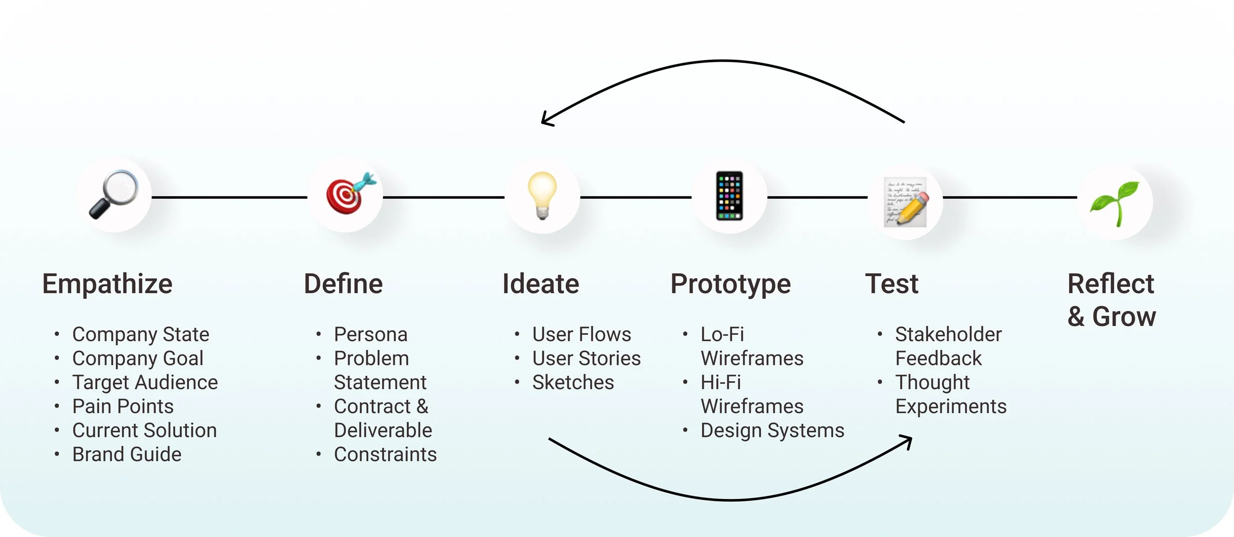
My Design Process:
It is a constant cycle of reiteration!
Empathize, understanding the user:
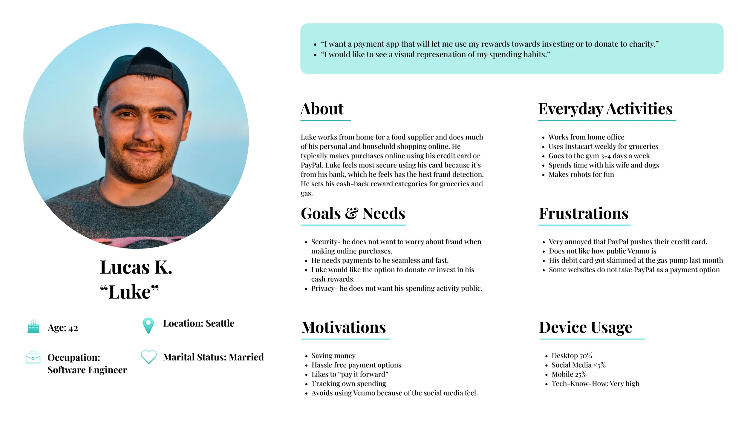
To better understand the user, I generated user personas, user scenarios, and user journey maps.
Information Architecture & Card Sorting:
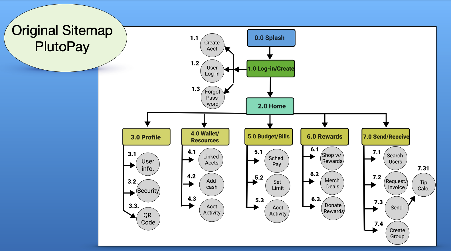
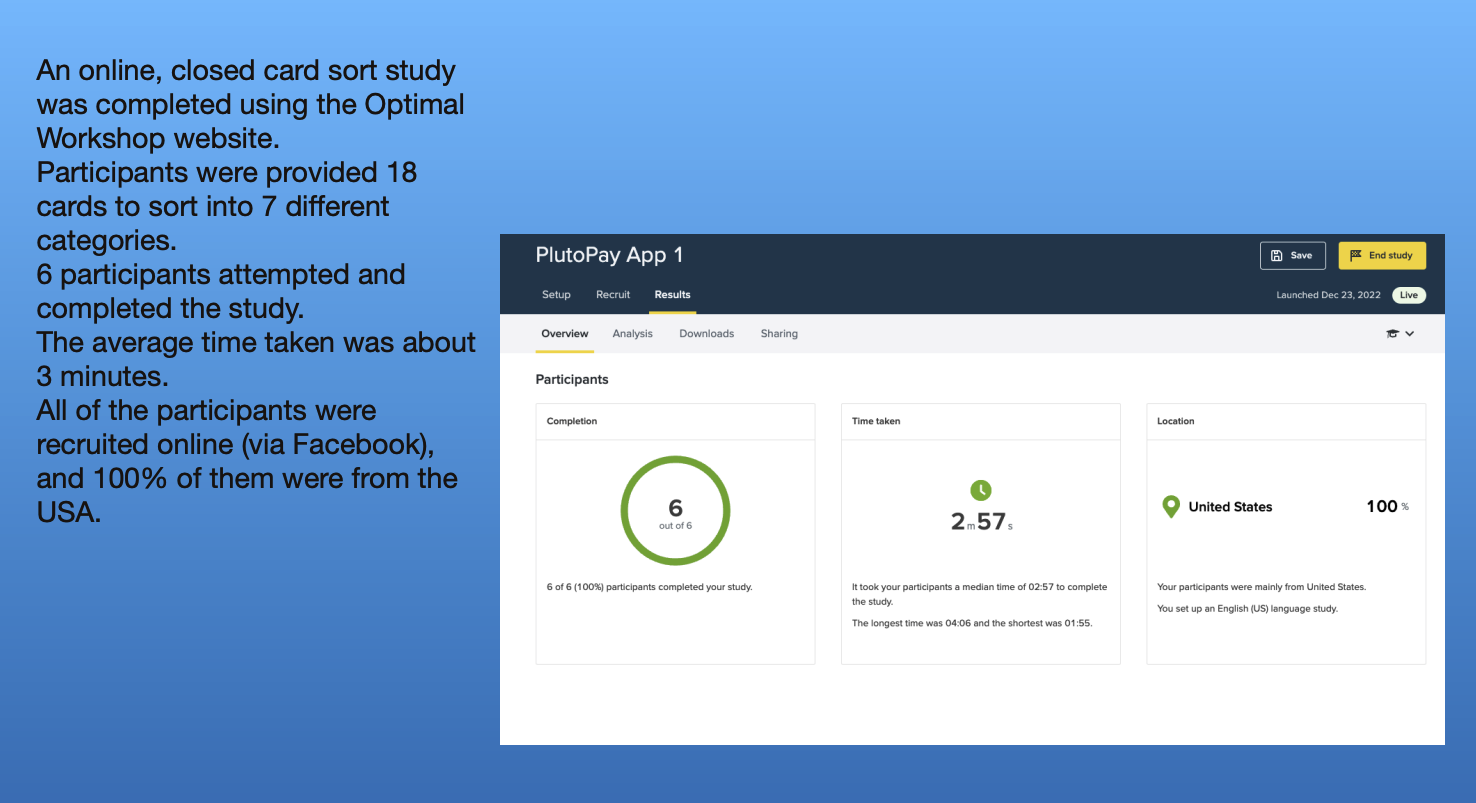
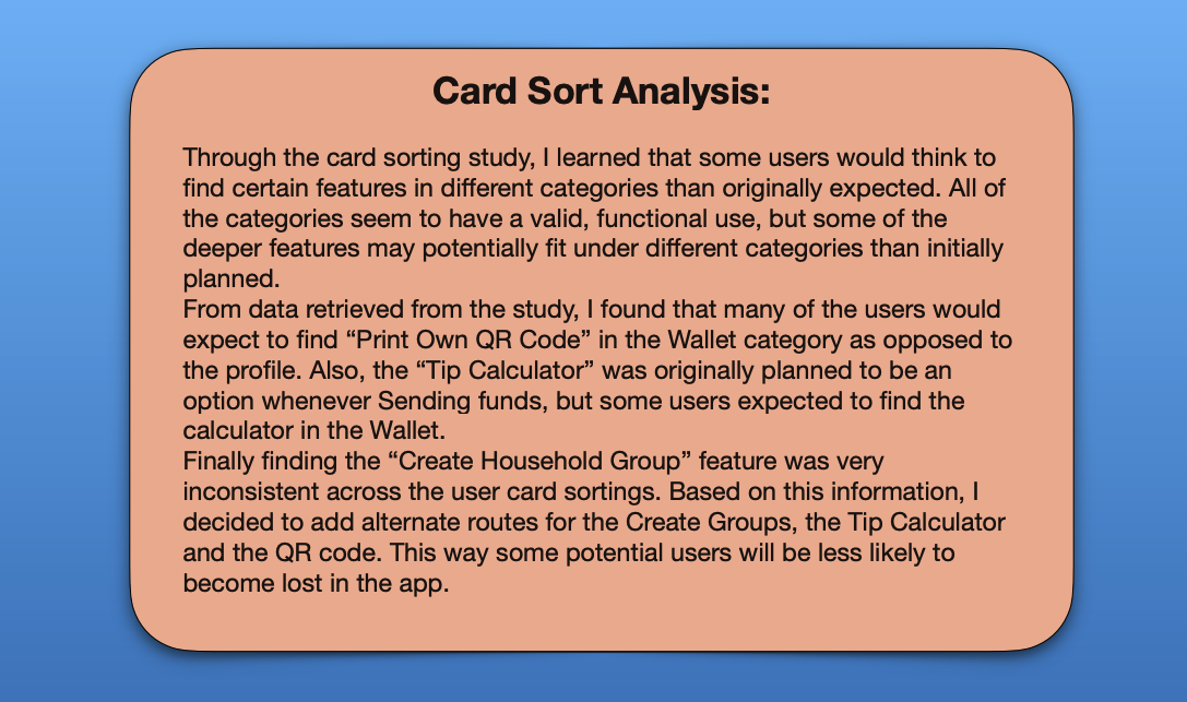
Based on the user journeys, I created a site to organize the information architecture for the app's features. From there, I conducted online user card sorting studies to update and streamline the sitemap to better serve users.
Wireframes, starting on paper:
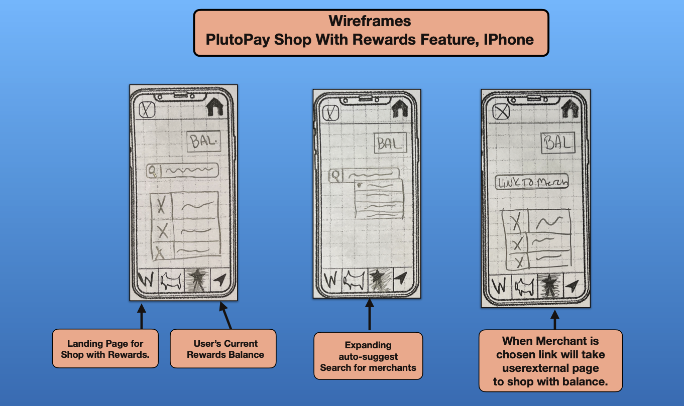
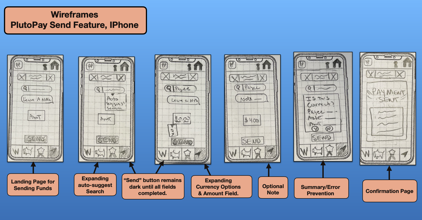
I then began the process of sketching wireframes on paper. Here you can see the early phases of the schedule bill payment, shop with rewards and send funds features.
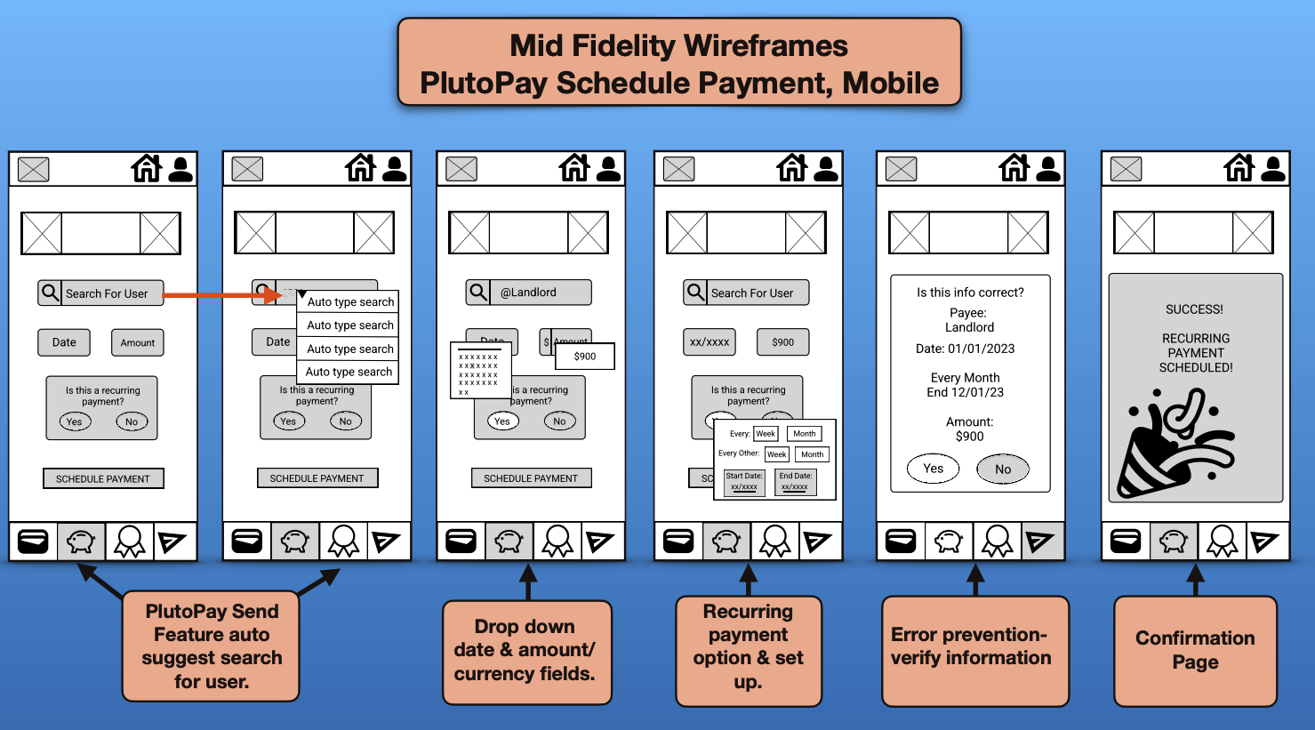
Wireframes progress to mid-fidelity:
Next I used Figma to create mid-fidelity wireframes .
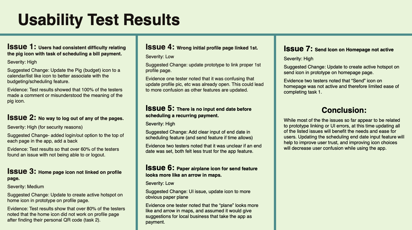
Mid-Fidelity user testing, results, and updates:
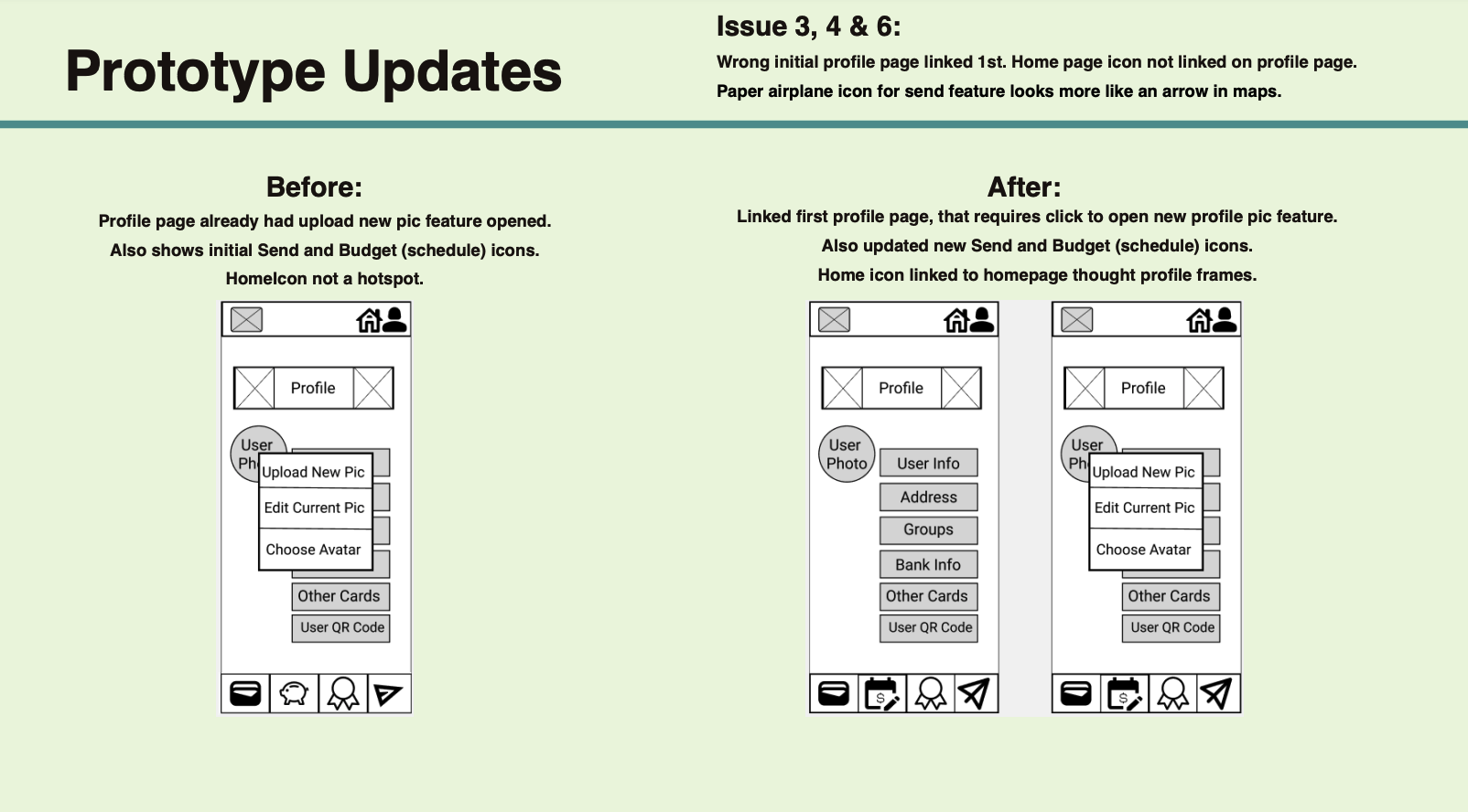
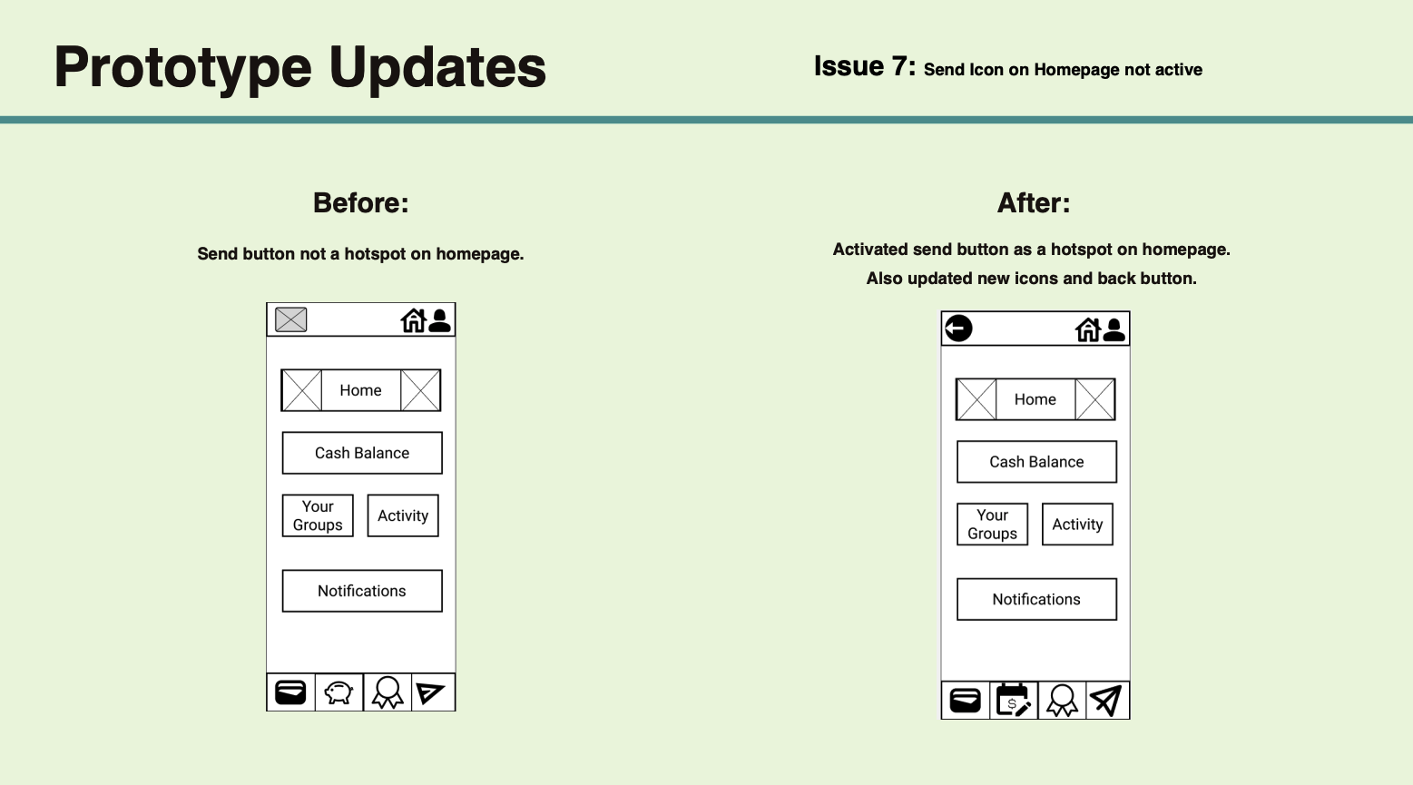
After creating the mid-fidelity wireframes, I developed a usability testing script and schedule. These testing sessions were completed both in person and online. Results were evaluated, and the wireframes were updated based on the findings.
Hi-Fidelity Wireframes and Preference Testing:
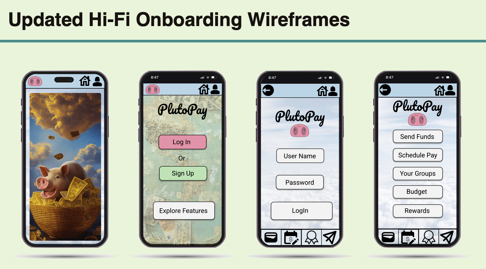
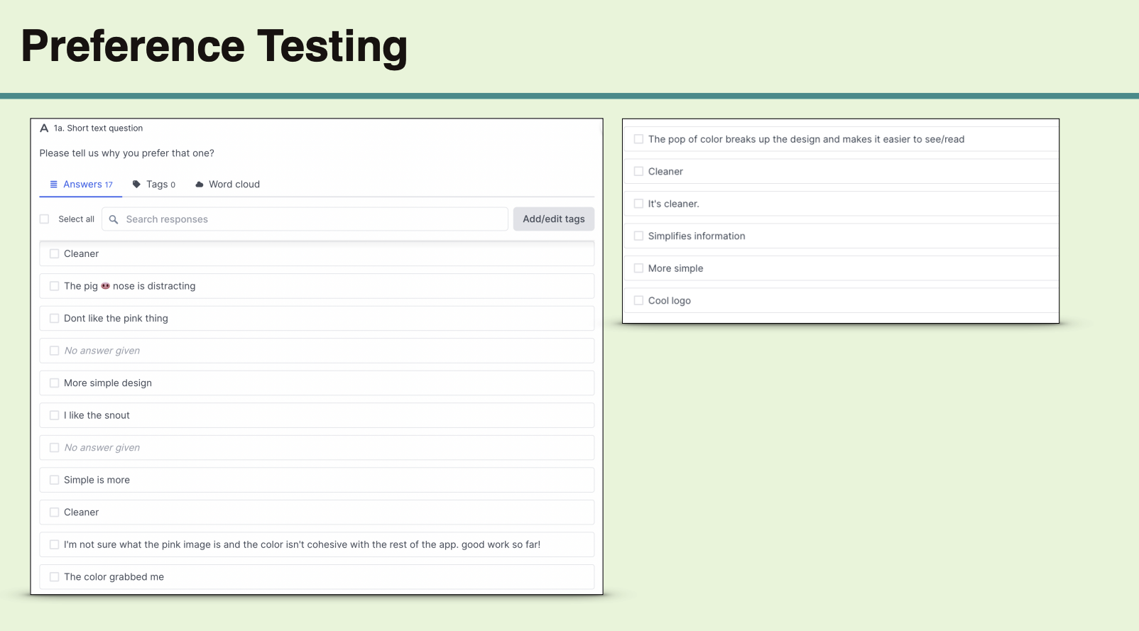
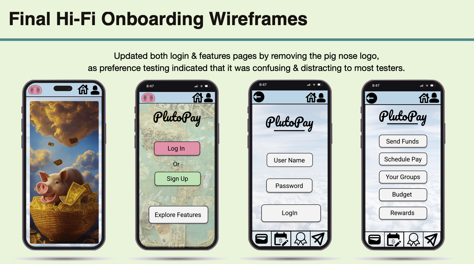
After the mid-fidelity wireframe user testing and updates, I progressed to creating hi-fidelity wireframes and conducted preference testing to fine-tune the high-fidelity designs.
PlutoPay Design System:
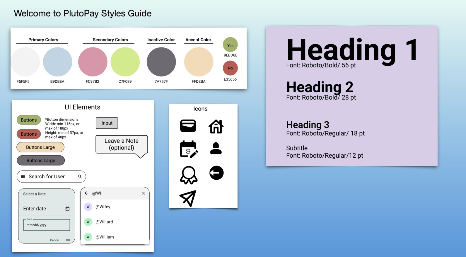
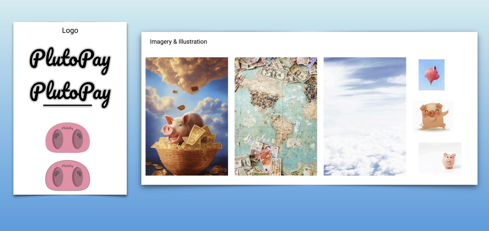
As the iterations of the hi-fidelity wireframes developed, I documented the design system.
Refining the design:
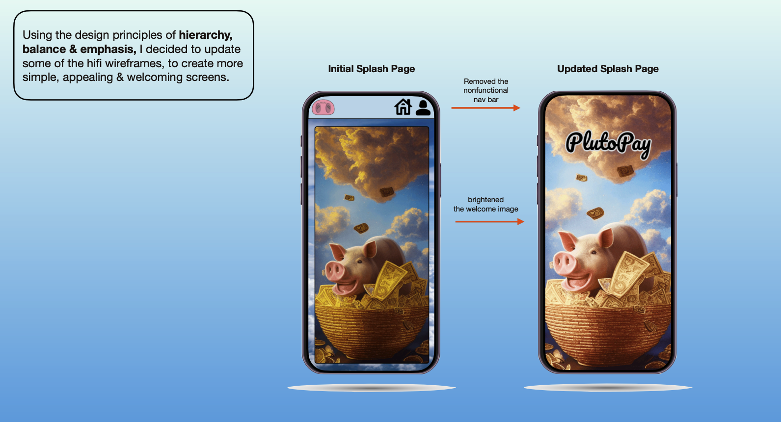
At this stage I updated the hi-fidelity wireframes using Gestalt Principles and accessibility review.
Peer Feedback:
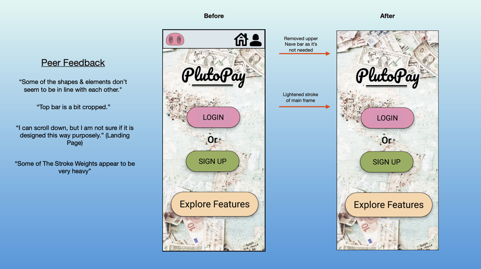
After updating the hi-fidelity wireframes, I reached out to my UX bootcamp community for feedback. I then reiterated the wireframes while taking feedback into account.
PlutoPay screen iterations:
See the side-by-side progress of the mid-fidelity to hi-fidelity PlutoPay app screen iterations.
What I learned:
In conclusion, what I learned working on the PlutoPay project is that gaining user feedback early and often is incredibly valuable when creating the most usable product, and for making key UX design decisions.

